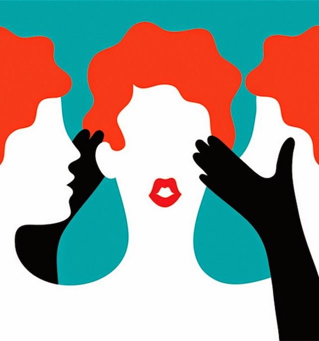
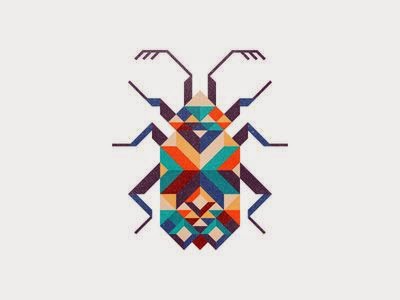
Making a pinterest account was a big thing in this module, I was reluctant at first as i'm not one to have accounts on sites but I've actually found it really useful when it came to looking for new illustrations. Although i don't think i applied this knowledge as well as i could have, i looked at the pictures on pinterest but then i rarely brought them over to my blog to discuss in detail. I think something i need to put some intense work on is putting into words why i like certain illustrations because at the moment if i'm put on the spot and asked to explain why i like something i just draw a blank. But although i can't exactly put it into words i have started to get a clearer picture of the kind of things i like.
Developing my visual side of this module i did a lot of drawing for fun, mainly the candy skulls. I chose my topic based on something i already tended to draw in my free time for fun. I tend to struggle when were given such an open brief because i feel like there isn't really anything i'm super interested in that would make a good project. But in this project i found that it doesn't have to be something you're already interested in, i just picked something i really enjoyed drawing and then researched on top of that and i actually found it much more enjoyable and i developed a real interest in my subject.
I think my biggest strength in this module was in using the cintiqs. Drawing straight onto the screen made it so much easier when it came to decisions on colour and shape as everything was instantly reversible but it still felt like normal drawing rather than digital. I got to work in shape, whereas normally i struggle to because when i'm working analog i don't have limitless colours at my disposal and you can't just stack things on top of each other easily. But working in shape actually helped me to work out some kinks in my characters i was having; a main one was necks, i just couldn't get the head connected to the body properly, it always looked wrong. But with shape the head and the neck were all in one and it just became a lot more simple to think about.
A weakness in this module was my blogging. I was looking at work but without blogging it and commenting on it i was neglecting to gain an understanding. I've struggled to put into words my opinion on something so i avoided it instead of developing. To combat this i'm going to start making myself look at work on a regular basis and comment on it. Also to start reading the articles written about pieces so that i can see what other people think as well. I need to get more in touch with how illustration is conceived outside of the illustration world: in context.
ACTION PLAN:
1: Look at illustration in the world on a regular basis
2: Read articles.
3: Develop my opinion. Comment on everything. Really get into an understanding of the kind of illustration i want to make.
4: Try working in different ways more. Trying different approaches to solve a problem (e.g shape, line, media,etc)
5: Take subjects from my drawing for fun more often. If i already enjoy drawing it then its going to be great to develop and learn about.
Tuesday, 27 May 2014
Adam Simpson
The first thing that strikes me about this is that it is very shape based. I really like the concept of the piece too and you can't resist but go up and down and check that they match, its a simple fun idea. This was commissioned by Stokely Design Associates to visually represent the way modern medicine is becoming bespoke to the individual although i feel this is a bigger thing in America and countries that don't have an NHS system. Instead their medication is marketed to people and sold as a product, which is kind of an alien concept to me. But I think the work still says something to the british viewer, to me it seems to show how far medication has come that we have almost a tablet for everything, the bright colours seem celebratory and as a whole it has a positive atmosphere.
Anton Van Hertbruggen
This is a spread from Anton Van Hertbruggen's 'The dog Nino didn't have'. This definitely has a hand made quality. Some of the angles are not quite right but it gives the piece a sense of charm. I also like the textures that you can see left behind by the brush. I think i like the brush strokes effect because a lot of technology has been made to help us refine illustrations and we can now make designs that are flawlessly clean cut and filled. But i think its good to see a bit of chaos in it, there's less control with a brush and there are lots of streaks and flicks that will be done by accident but those little flaws are what make it look genuine and handmade.
Moving News stories
I like that the colours are contrasting in vibrancy from the tv to the room. The way he's worked in shape makes it seem slighlty more realistic in a way, like we don't have bold outlines in real life. Instead he's only used line when it is needed to show a bend or crease in a block of colour, and then in a darker and richer tone so that it compliments the colour it is sat on.
I think that, with more news being read online rather than in a paper, short gifs can be used for editorial illustration. Its like illustration taking advantage of the technology available.
Magical Game Time
For a while i've been visiting Zac Gorman's page magical game time. I like the small animated touches he makes to his comics, it makes them feel more real. And in some of the cases can make a scene more intense.
Link Comic
Intense storm at sea
Link Comic
Intense storm at sea
I like the use of line, every thing definatly has a hand made quality about it and the loose shapes and colouring kind of remind me of Quentin Blake's work.
Creative strategy 1. Presentation.
I made myself cue cards so that i wouldn't forget what i needed to say.
I decided that since i wasn't great at talking and presenting to a group i'd make short gifs to show what i mean with the slides.
The gifs were really well received and people found them funny, they really helped me to express my points.
After the book brief i felt that a book sized project was the only option and freaked out a bit.
Some of the cartoons i've been watching this year.
Scores for the colour\gradient test.
I can't see colours properly
Being online, setting up a pinterest and general online exploring.
Struggling under the pressure of a book.
Drawing for fun.
The kind of humour i like.
Colour pallets i like.
Getting a kick up the butt.
My love of the light box.
Simple designs i've really liked.
Textures i like.
The constant battle between feeling pumped up and ready and feeling like a failure.
Subscribe to:
Comments (Atom)


