Showing posts with label OUIL502. Show all posts
Showing posts with label OUIL502. Show all posts
Monday, 18 May 2015


Pattern is key

I tend to struggle sorting out colour pallets and making them work and so if I do a crowded scene things tend to blend into one another because they look very similar and theres no great contrast in the colours. But this shows that a use of pattern can really make things stand apart. I think my problem is when I try and make a pattern to fill something I'm trying to think what would make sense and what communicates the texture best. But I think that sometimes I should just let loose and try lots of different ones because in the image above I wouldn't have tried some of these for trees and it shows that its always worth just experimenting. I think I Should start a book of patterns to just use as a dictionary.
James and the Giant Peach

by Livy Long
I liked this book cover because its quite minimal in its design and colours. The texture put in makes it seem more held back, softer to the eyes. It makes it more appealing I think and suites the story. The characters inside the peach are made to be quickly recognisable without too much detail and I think it has achieved this very well. The colour on the font makes it more obvious of its purpose. The orange text in sea makes for a thick amount of colour when everything else has lines of cream in them. This makes the cover quite bottom heavy and thats the place eyes are drawn to after the peach. The author name however is in pale blue at the top. It makes it seem whispey and light, an after thought. I think it was less important to the design who the author was and more focused in on the story and narrative itself.
Printing onto other things


I like the idea of printing on top of other documents. I really like how effective it is to have the actual visual information, like the official, mixed in with your own style of drawing and printing. It provides a nice contrast between design. This is a technique that could even be used in collaboration projects where one could worn a piece and the other will work their piece on top of it.
I think this shows that I've not fully explored the [possibilities of layering in screen print and it is something I need to explore.
Tiny Screen Print

So screen printing is a potential for over the summer when I won't have access to the college resources. I always feel like I want more time to work on my screen print skills but I find the whole experience so stressful that I tend to just avoid it. Also I feel like it's not ok to just go down to the room to play about for no real reason other than experimentation because there are limited screen beds and I feel like I'm depriving some one else. Also I like the idea of making lots of tiny screens. Maybe them themselves can be a product then people could get one and they'd just have to get the colour ink of their choice and they can print onto anything they want.
Also this size is really portable so its a possibility to even do screen printing on the go. Maybe holding up the screen and drawing straight onto it from reference or looking through it for scenery reference. There are a lot of possibilities with pocket screen printing.
Bright Mountains

I really like this screen print because it manages to pull off bright colours without being gaudy and visually loud. I think that its the texture that makes it work. The little breaks in colour reduce the glare and vibrancy of it. It gives the weathered effect which contrasts from its bright colours. The white mountain separates the yellow and the pink and I think this is because if the pink was directly next to the yellow colour theory dictates that the contrast would make it seem more vibrant and it may seem like an acid yellow. But the white give a break to the colour and spaces it out giving a much lighter over all feel. The colours are reminiscent of a sun rise/set when the sky starts to have hues of pink and purple. This gives the piece a sense of calm because it is pre associated with those times to either be done with the day and over or its a new day with new potential.
Hand drawn

I liked this image because it uses two colours and although it seems really simple it has the charm to pull it off. It looks like its been drawn straight on with no previous planning, its getting the balance between just quick doodles and full length masterpieces. Sometimes letting yourself into a couple of wiggly linbes and mistakes adds so much more in personality than you could have achieved with hours of planning and measuring. Hand made stuff always seems to hold a certain amount of charm for me, it's something I feel I should get back into. I have been enjoying coloured pencils so maybe I should run with my colouring analogue.
Bear with me

I liked this pice mainly for its humour. Theres just something satisfying about a pun. I like silly puns and I think that is something I should work into my projects more. I need to figure out how to mix my humour into my work without it feeling strained.
I like the simplicity of this piece, it being a one colour print; I think this is because its the joke that drives this piece and they don't want to take attention away from that.
Pattern Cat

I like this screen print for its use of negative space. nothing is made with outlines it is instead dictated on where the pattern peters out. I like the textured striped on the cats body a lot. They look like they've been made with chalk or a pastel dragged a long. This shows that you can use a variety of texture making techniques and they work together in one print. The minimal colour scheme gives the image a sense of calm as well, the density of the pattern also makes it look like sometimes theres an extra colour.
Its colour theory I guess, the grey colour looks darker next to the black of the basket
Log cushion

I never even thought before of using screen print on fabric to create an entire texture. This opens up potential for so much printed fabric products. I like how its in the style of some thing very comic illustrated. The lines are thick and distinctive shapes show you what it is. Seeing these lines on a 3D thing gives it a pop art effect. Really eye catching, I think this is something that would sell well because it has a practical purpose as a cushion/ home decoration.
Eiko Ojala

This paper cut piece is by Eiko Ojala. I like how the white acts as the main part which makes the colours really stand out from the paper. The process of cut paper means that the lines are satisfyingly crisp. The composition of the piece is interesting because the line of sight is drawn to the middle because thats where all the colour is but then you are led up and down by the smaller details of the birds and the house. I think this piece really uses its negative space as more mountains have been created using the white base paper and over laying the coloured mountains. I like this way of thinking; getting more detail in without adding too much. Simplicity is the way forward.
Caitlin Mcgauley

This watercolour painting is by caitlin mcgauley.
I like this piece because the subject is one of reminiscing and childhood. A friendship bracelet is such a charming idea and the watercolours suite that perfectly. The control of the brush is a bit wiggly but I think a higher sense of hand made is working for this piece because the bracelets it showed are the ones you used to make by hand for each other. The bright colours give it a happy feel. I feel this is something that would work being sold as a single print because the connotations of the image is enough to draw peoples attention if only to remember fondly for a moment.
Petit Jardin

Terrarium postcards by Petit jardin.
I like that the colours are of a low saturation but not so much that it would look greyish just leaning more towards pastel. This light and cool colour vibrancy creates a sense of charm. I think they work well as floating spot images because the sense of it fitting on the page makes it seem small and cute. Whereas if it was an off the page illustration I'd feel more like I should be impressed by it.
Michael Deforge

Michael Deforge was the other illustrator who's comics I bought over the summer. I kind of just went crazy on him and jesse jacobs and no one else. The thing I like most about Michael Deforge's work is the detail in the line work. Nearly every space is filled with little lines to describe what the texture and shape is like. I liek how the wiggly lines can make it look so repulsive you can almost imagine the squishy, slimey texture of it. I want to be able to acheive this level of repulsion yet intrigue because of the detail and the bright eye catching colour pallet.
Jesse Jacobs

I bought more comics over the summer but my main interest was Jesse Jacobs. I even managed to get the travelling man in York to let me have the last copy of safari honeymoon he'd been saving for himself although I think that was more down to me being a girl than my persuasive skills.
The comics I bought by him were :
Even the giants
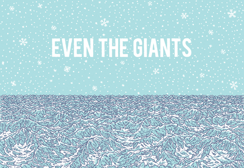
I liked this one because of the simple progression from panel to panel. Some of them are almost like stills of animation. This leaves lots of panels to explore the line as texture he does.
The story has breaks in it of random pages that just have other comics on or poems. The panelling structure in his one million mouths run is really interesting instead of being separate images it is just a stack or congregation of boxes with characters inside each speaking one line of the thought/statement. I liked how this made written word more palatable alongside the drawings. Each imge can just hint at what its saying, it's overall the images/characters work together to create the tone of the piece. The colours as ever are minimal. He uses other colours to make lines, each choice seems to be based upon the colour scheme of the image. Colour is a consideration in every page. I think this is something I should work into my own work as its very heavily line based and this could be a good way to get a balanced colour pallet that works well on the line work.
By this you will know him

For this story it was the concept that I enjoyed the most it begins with creatures who are creating worlds and universes as part of an art project. One is making carbon nased life forms and he basically makes earth. It's like a whole new look at a creation story, thinking outside of the box. I think the key to a good story like this is taking something normal that everyone knows, like the origin of species/ creation theory and look at it in a different way. His narrative skills are impeccable and I couldn't put the comic down until I finished the story. This also contained some of my favourite drawn images. There is one panel where one child has smashed the other over the head with a log and the panel shows his brains mid splatter. The wiggly lines and detail inspired to get down into the gross. I think that images has been one of the biggest influences on my visual work all year.

Safari Honeymoon

This book was super nature. i really like all the wiggly shapes and flowing lines. This comic showed me that nature is an open book, like you can pretty much draw anything and its possible in nature because nature is crazy like that. The narrative to this story was another impressive one. I like how Jesse Jacobs narratives seem to dart back and forth between different parts instead of just religiously following one character through the narrative which I think is a bad habit I've picked up.
Networking: The Plan
The Poetry Collective
When I was at thought bubble this year I spent most of the first day sat alone at my table because Hollie had to still print out some of her work at college. The tables were quite large and so I was sat relatively far away from other people. It was also quite loud and crowded in the hall so I just assumed since I couldn't really distinguish what anyone else was saying that no one could hear me either. I then spent the next 2 hours or so singing parts of songs to myself repeatedly. Mainly man or muppet, I found out around the time that I'd exhausted the chorus of that song that I was not in a sound proof bubble.

When I was at thought bubble this year I spent most of the first day sat alone at my table because Hollie had to still print out some of her work at college. The tables were quite large and so I was sat relatively far away from other people. It was also quite loud and crowded in the hall so I just assumed since I couldn't really distinguish what anyone else was saying that no one could hear me either. I then spent the next 2 hours or so singing parts of songs to myself repeatedly. Mainly man or muppet, I found out around the time that I'd exhausted the chorus of that song that I was not in a sound proof bubble.

Dilraj Mann was sat next to me and it was around this point he leaned in and spoke to me. It turned out he'd been able to hear me singing the entire time. I was suitably horrified but it led to a very fun and interesting conversation. We chatted throughout the event. It was chatting to him that pushed me to approach other people at other tables and just generally get out there in the illustrative community.
This gave me my networking plan
It started as I would send a short illustrated poem about how I met the person, for Dilraj it would be about my terrible singing. I want to send out poems to lots of different illustrators and just see who has time to send one back. I'm not looking for high quality, I just want to open up communication.
Then the ultimate plan:
At thought bubble I talked to a lot of people who were in a similar position to me, early in the business and not long out or in uni. I want to get to know those people because in ten years they are going to be my competition, my community.
So Thought bubble 2015 I applied for a table and didn't get one but I'll still be attending the event and I've been offered some table space form other people in our class who did get a table.
I'm going to use my time at thought bubble as networking time. I want to talk to as many people as possible concentrating mainly on the fresh faces and ones who are relatively new to professional illustration. Basically people who I feel are at a similar level to me. I want to invite them to have a dialogue of silly poems. Something I would make into a zine and pitch to travelling man or other local comic shops to sell in their small press section.
I want to build a little community of up and coming illustrators. An open contact book of potential collaborators. And just generally having people in a similar position that I can ask questions to. We can have a facebook group and use it to notify each other of events coming up and any meet ups or work people want to collaborate on. It should be something that everyone can get something out of.
Personal practice: The pack
WHY SHOULD KIDS HAVE ALL THE FUN?
A mock up look of my professional pack
I plan to use my summer to make my pack to a professional standard and start using it to network. At this point I haven't left enough time to do a final pack but this mock up gives an accurate idea of what the final product will look like.

So with making the box I was trying to make it resemble a 'Happy meal' box, originally it was going to be all in the green paper or in a pattern time permitting. But I was looking through my old thoughtbubble stock which I have an abundance of and I found that there was work in there that I liked. I think that work represents me as an illustrator better than some of the stuff we did for modules because it was totally self driven. I picked all the topics and the colours etc.

At this point it is sealed with a peg with 'why should kids have all the fun?' this is just a temporary measure since I didn't have the time or the digital programs at home to make the logo to act as a handle, similar to the macdonalds M working as a handle on its happy meals.


I would attach my business card to the front so that it is immediate what this is about. The letters on the logo would be cut out to make room for finger holes.

The opening mechanism isn't as neat as I would like and in redoing it properly I will find nets of happy meal boxes to get that sloped roof top right.

The frame of my box is made out of mountboard since the paper wasn't strong enough to hold the contents on it's own. I like how it frames the top of the box, makes it look like a goody box. Invites a sense of childish excitement.

The contents of my pack:
Droopy peeps and Saggy teets : a set of stickers that are devilishly childish. Perfectly sized and transparent for playful photo pranking.
Note books: Coloured mini notepads with cut out covers to show the colours complimenting each other.
Mini Crossbow: This is my toy, the free prize at the bottom of the cereal. It's purpose is just for fun, its a simple design made out of a peg as well. But it fires matches which makes this strictly adult toy. Which fits in with my whole why do kids get all the fun thing.
Business card: With pull out tongue and links to tumblr and facebook page.
Jump: A small comic demonstrating my sense of humour
Not so pretty things: Just a collection of the kind of drawing I do
Procrastination: Demonstrates I can use other medias and also because its a narrative that I'm proud of for its sense of light humour and relatableness.

The droopy peeps and saggy teets are my favourite part of my pack. Their just so deliciously naughty and childish. They are hand drawn onto sticker paper at this point but since I enjoyed them so much I plan to make a set and print copies onto sticker paper. Maybe trying some on opaque so I can add colour. The potential for sickly greens and mustard yellows is limitless.
Personal Practice: Business card
So I made this business card quite early on. I wanted to run with the nature theme in my work recently but I also wanted it to convey my style and what I like to do. I think the plant monster works because theres room for saliva and lots of texture with the natural bits. I made the tongue a pull out tab that would display the Illustrative name. On this mock up it just says Rowena Sharp Illustration but on a final product it would say Big Ween Illustration. Information on how to get to my blog and facebook page would be on the back. I made the design go over the edges of the business card template.


I traced over the business card design digitally because my original mock up got bent in my bag. But it's always an issue that I don't like the quality of my line work once it's scanned in. By tracing I've managed to get the same shape with clearer lines. Although at this point I can only do it on the cintiq where I have direct contact with the image whereas with a tablet I'm still a shaky tracer.

I changed some of the colours because I think that there were a few too many in the old one. Also I've changed my hair colour since then, this one fits really well with the colour scheme. But I think that that's a detail I could change each time I send them out so that it matches the current colour.
Personal Practice
I've finally set up a facebook page to put my work up onto. I need to redo the banner, make something specific for it because non of my images really fit in it. I just ended up picking one.
https://www.facebook.com/bigween
https://www.facebook.com/bigween
Subscribe to:
Posts (Atom)