I put my promo video on the front page. This will be replaced with the proper one once it is done
I had a photo of myself on the site because i like it when there is a personal touch, and since m illustration name is silly i think its good to point out that there is a person behind it.
I think i'm going to delete this contact bit, i put my details down so that they can message me personally. But i remember it being said that these contact forms make it all seem impersonal.
More personality for the front of my gallery
I split my gallery into lots of subsections. Some were obvious and different media and format; the prints, comics, poetry and animation sections. I made the insect and plant section just because it is something i draw a lot and i feel it's quite distinctive in my work so i think it deserves to be show cased separately.
It's actually limited what i can put on the site as recently i transferred a large amount of files of work onto my laptop which then inexplicably deleted them. But i salvaged what i could
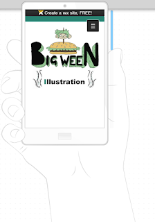
This is the phone view. I've been making sure that this is up to parr as well because i want it to work on both platforms easily. As people are using phones to access internet more and more.


No comments:
Post a Comment